Affinity mapping is the sticky-note method: write every observation from your research on its own note, spread them all out, and move them around until the ones that belong together are together. It is the most common synthesis technique in UX research because it needs no training, works in a room or on a whiteboard tool, and gets a whole team looking at the same evidence at once. This guide covers how to run it well, how to get from clusters to findings, and the point at which it stops scaling.
What is affinity mapping?
An affinity map (or affinity diagram) is a bottom-up grouping of individual data points by similarity of meaning. In UX research the data points are observations from interviews, usability tests, or field studies — one per note — and the groups become the themes of the study. It is a hands-on way of doing the "search for themes" phase of thematic analysis.
The method's power is that the structure comes from the data. You don't decide the categories in advance; you discover them by moving notes.
How to run an affinity mapping session
1. Prepare the notes
This step determines everything. Each note should be:
- One observation. Not a summary of a participant — a single thing they said or did. "Copies the numbers into a spreadsheet to check them" is a note. "Has reporting problems" is a category.
- Specific and in their words where possible. Quotes and observed behaviors cluster better than interpretations.
- Tagged with its source. Participant ID at minimum, timestamp ideally. Without this, a cluster can't be checked and a quote can't be found again.
For eight interviews, expect 150–300 notes. If you have far fewer, the notes are too summarized; if far more, they are too granular.
2. Spread them out and read
Everyone reads every note before anyone moves one. Ten minutes of silence. It stops the first person's mental model from becoming the map.
3. Cluster in silence
Move notes that seem to belong together next to each other. No discussion yet, no labels yet. Anyone can move any note, including out of a cluster someone else made. Silence matters: talking turns clustering into negotiation.
4. Name the clusters
Once movement slows, write a label above each cluster — a sentence, not a word. "Reporting" tells you nothing; "People rebuild the weekly report because they don't trust the in-app numbers" is a finding. If you can't write a sentence for a cluster, it isn't one yet; split it or dissolve it.
5. Look for structure between clusters
Often clusters group into super-clusters, or a cluster turns out to be the cause of another. Draw those relationships. This is where the latent themes — the ones under the surface — show up.
6. Turn clusters into findings
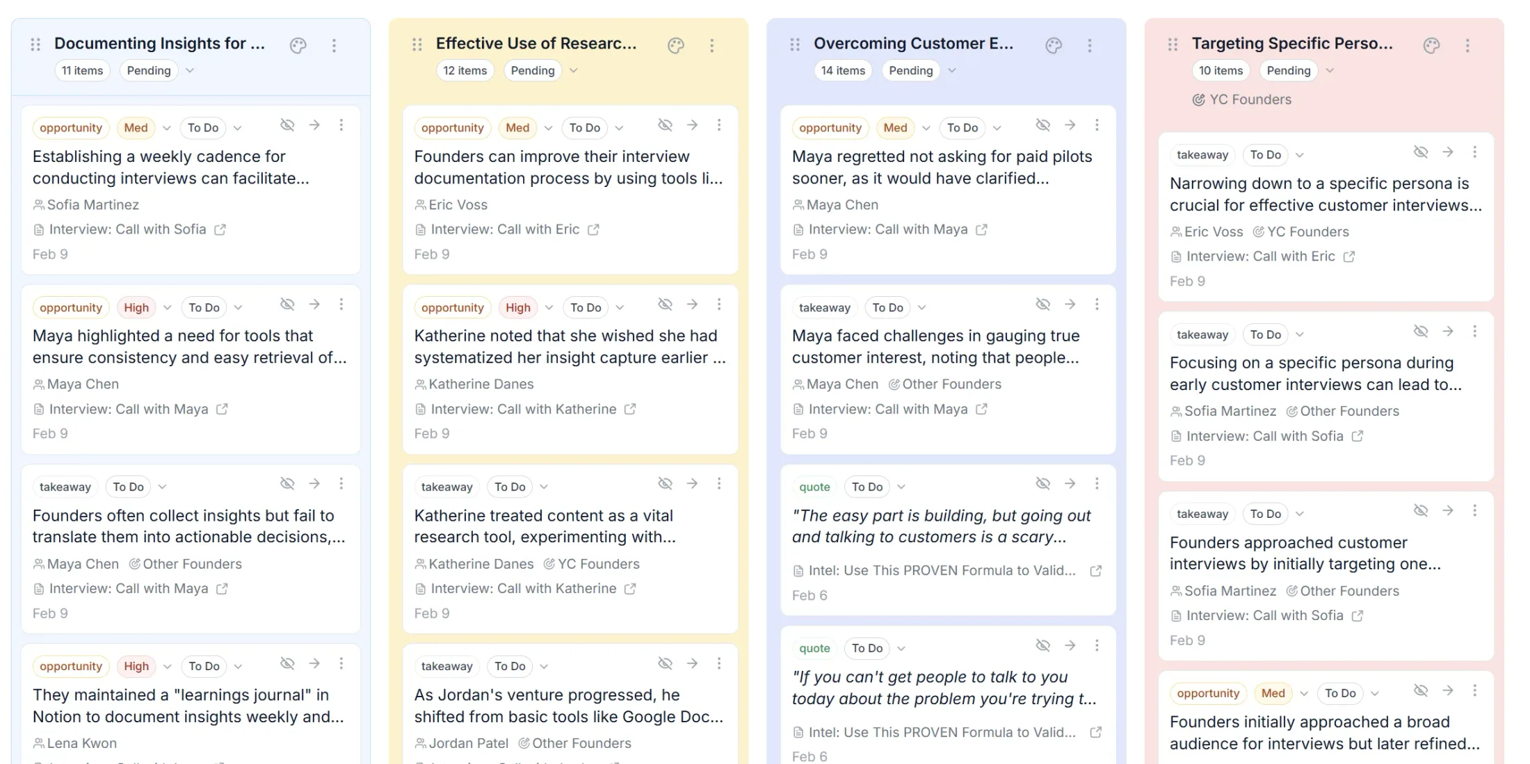
For each cluster, record: the finding as a sentence, how many participants contributed, which segments they were from, and the two or three strongest quotes. That is the output. Photograph the wall, but the wall is not the deliverable — the list of evidenced findings is.
Practical tips
- Timebox to 90 minutes. Longer sessions produce over-clustered maps and tired judgment.
- Three to five people is the sweet spot. More and the silent-clustering phase becomes chaos.
- Include someone who didn't do the interviews. They ask what a note means, which surfaces the assumptions the interviewers were carrying.
- Keep an "unsure" area. Forcing every note into a cluster invents patterns.
- Don't cluster by participant or by question. Both are the researcher's structure, not the data's.
Where affinity mapping breaks
Affinity mapping is excellent for one study of five to ten sessions. It breaks in predictable ways beyond that:
- It doesn't scale. At 30 interviews the wall is unreadable and the session takes a day. At continuous research — a few interviews every week, forever — there is no session to run.
- It doesn't remember. The map from March isn't connected to the map from June. The same theme is rediscovered each quarter and never accumulates evidence.
- It loses the link to the source. Once a note is a sticky, getting back to the transcript line takes archaeology.
- It's only as good as the notes. Summarized, interpreted notes produce a map of the researcher's opinions.
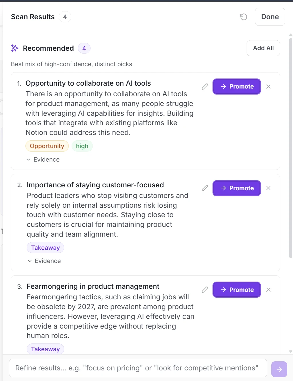
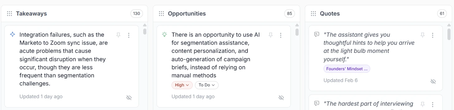
The fix isn't to abandon the method; it's to change the medium. Tools built for interview synthesis keep every observation linked to its transcript, propose the clusters across all your interviews rather than the ones in this session, and let themes accumulate evidence over months. That is how Intervool treats it: AI proposes the grouping across every interview, you accept, merge, or split with the same judgment you'd use at the wall, and each theme stays one click from the quotes behind it. See our thematic analysis tools comparison for the range of options, and how to analyze customer interviews for the full method the mapping session sits inside.